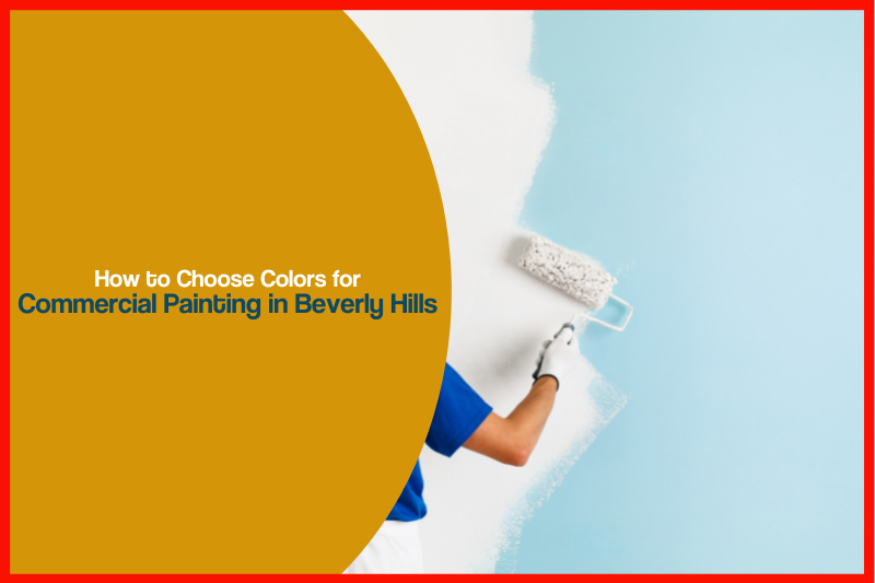
When you run a business, impressions matter. Everything from the decor to the customer service counts. That includes the color of your office, store or other establishment. It can feel a bit overwhelming to choose which colors, with so many available, for commercial painting Beverly Hills. Luckily, Just Right Paint is here to help. We specialize in commercial painting and can help you get the right shade for your business. Here’s how it’s done.
Consider Psychology
There is a lot of research that talks about how color drives emotions and affects mood. Keep this in mind when you choose paint colors if you’re trying to invoke certain feelings among your clients and customers. Bright colors energize your employees and customers, while soothing colors bring calmness to a high paced environment.
Stick with Your Brand Colors
If you have a brand made up of certain colors, stick with those shades when you paint your business. This creates a cohesive look that is also memorable to customers. A recognizable logo is an easy way to drive business to your store so keeping your paint colors in tune with that is good for your bottom line. Bright colors are especially memorable so consider using them if you’re still developing your logo.
Pair Colors
If you look at a color wheel, you’ll see that some colors complement each other well, while others just don’t go together. Choose colors that are across from each other on the wheel if you plan to combine more than one shade. Examples of complementary colors are blue and orange or yellow and purple. Keep them together when you are choosing commercial painting in Beverly Hills so that you don’t end up with something that clashes, distracts customers and hurts your business.
Have a Look at the Environment
It’s also important to consider the location of your commercial business. In some places, you may have to follow guidelines regarding what colors you can use. You’ll also want to avoid looking too much like the other businesses in the area so that you can set yourself apart and stand out to clients. You also want a color that creates proportion to the eye, which is subconsciously more pleasing and makes people feel better about patronizing your business.
Look at Other Places
Still having trouble deciding what color to choose? Take a tour of other businesses to see what they’ve chosen. This might be all the inspiration you need to settle on the right shade for your place. Warehouses are often painted in neutrals, like white, beige, grey or tan, but you can stand out by adding in some bright pops of color. In offices, neutral colors are usually best, but you can integrate some color with the decor. Retail stores can grab the attention of customers much more easily with bright colors, like pink and purple. Keep your audience in mind when choosing colors and you should have no trouble picking the right one.
Ready to get started with your commercial painting in Beverly Hills? Call Just Right Painting today for a free quote.